Welcome to the third project of the Machine Learning Engineer Nanodegree! In this notebook, some template code has already been provided for you, and it will be your job to implement the additional functionality necessary to successfully complete this project. Sections that begin with 'Implementation' in the header indicate that the following block of code will require additional functionality which you must provide. Instructions will be provided for each section and the specifics of the implementation are marked in the code block with a 'TODO' statement. Please be sure to read the instructions carefully!
In addition to implementing code, there will be questions that you must answer which relate to the project and your implementation. Each section where you will answer a question is preceded by a 'Question X' header. Carefully read each question and provide thorough answers in the following text boxes that begin with 'Answer:'. Your project submission will be evaluated based on your answers to each of the questions and the implementation you provide.
Note: Code and Markdown cells can be executed using the Shift + Enter keyboard shortcut. In addition, Markdown cells can be edited by typically double-clicking the cell to enter edit mode.
%reset
Getting Started
In this project, you will analyze a dataset containing data on various customers' annual spending amounts (reported in monetary units) of diverse product categories for internal structure. One goal of this project is to best describe the variation in the different types of customers that a wholesale distributor interacts with. Doing so would equip the distributor with insight into how to best structure their delivery service to meet the needs of each customer.
The dataset for this project can be found on the UCI Machine Learning Repository. For the purposes of this project, the features 'Channel' and 'Region' will be excluded in the analysis — with focus instead on the six product categories recorded for customers.
Run the code block below to load the wholesale customers dataset, along with a few of the necessary Python libraries required for this project. You will know the dataset loaded successfully if the size of the dataset is reported.
# Import libraries necessary for this project
import numpy as np
import pandas as pd
import renders as rs
from IPython.display import display # Allows the use of display() for DataFrames

# Show matplotlib plots inline (nicely formatted in the notebook)
%matplotlib inline

# Load the wholesale customers dataset
try:
    data = pd.read_csv("customers.csv")
    data.drop(['Region', 'Channel'], axis = 1, inplace = True)
    print "Wholesale customers dataset has {} samples with {} features each.".format(*data.shape)
except:
    print "Dataset could not be loaded. Is the dataset missing?"
# print data head and tail
display(data.head()); display(data.tail())
Data Exploration
In this section, you will begin exploring the data through visualizations and code to understand how each feature is related to the others. You will observe a statistical description of the dataset, consider the relevance of each feature, and select a few sample data points from the dataset which you will track through the course of this project.
Run the code block below to observe a statistical description of the dataset. Note that the dataset is composed of six important product categories: 'Fresh', 'Milk', 'Grocery', 'Frozen', 'Detergents_Paper', and 'Delicatessen'. Consider what each category represents in terms of products you could purchase.
# Display a description of the dataset
display(data.describe().round(2))
Implementation: Selecting Samples
To get a better understanding of the customers and how their data will transform through the analysis, it would be best to select a few sample data points and explore them in more detail. In the code block below, add three indices of your choice to the indices list which will represent the customers to track. It is suggested to try different sets of samples until you obtain customers that vary significantly from one another.
# TODO: Select three indices of your choice you wish to sample from the dataset
import random
# indices = [random.randint(0, data.shape[0] - 1) for _ in range(3)]
indices = [100, 250, 385]
print "Select the sample: ", indices

# Create a DataFrame of the chosen samples
samples = pd.DataFrame(data.loc[indices], columns = data.keys()).reset_index(drop = True)
print "Chosen samples of wholesale customers dataset:"
display(samples)
Question 1
Consider the total purchase cost of each product category and the statistical description of the dataset above for your sample customers.
What kind of establishment (customer) could each of the three samples you've chosen represent?
Hint: Examples of establishments include places like markets, cafes, and retailers, among many others. Avoid using names for establishments, such as saying "McDonalds" when describing a sample customer as a restaurant.
Answer:
What kind of establishment (customer) could each of the three samples you've chosen represent?
The
indices = 100data point most likely represents a large scale restaurant. The values of all categories, exceptfresh, are over the 75% (upper 25%) of the data, which may mean the data point represents a high-end restaurant.The
indices = 250data point most likely represents a small-size restaurant. Annual spending amounts for 5 categories are in the lower 25% of the data, and the delicatessen are near the lower 25%.The
indices = 385data point has 3 categories (milk, grocery, frozen, detergents_paper) in the lower 25%. On the other hand, spending onfreshis in the upper 25% and annual spending ondelicatessenare near the median. The annual spending pattern indicates that this customer most likely represents a median- or smaller-size grocery store.The percentile ranks and the samples compared to median and to mean can provide descriptions above.
import seaborn as sns
import matplotlib.pyplot as plt
# look at percentile ranks
pcts = data.rank(axis = 0, pct = True).iloc[indices].round(decimals = 3)
display(pcts)

# visualize percentiles with heatmap
plt.title('Percentile ranks of\nsamples\' category spending')
display(sns.heatmap(pcts, vmin = 0, vmax = 1, annot = True))

# Plot of samples compared to median or to mean
((samples - data.median()) / data.median()).plot.bar(figsize = (16,6), title = 'Samples compared to MEDIAN')
((samples - data.mean()) / data.mean()).plot.bar(figsize = (16,6), title = 'Samples compared to MEAN');


Implementation: Feature Relevance
One interesting thought to consider is if one (or more) of the six product categories is actually relevant for understanding customer purchasing. That is to say, is it possible to determine whether customers purchasing some amount of one category of products will necessarily purchase some proportional amount of another category of products? We can make this determination quite easily by training a supervised regression learner on a subset of the data with one feature removed, and then score how well that model can predict the removed feature.
In the code block below, you will need to implement the following:
- Assign
new_dataa copy of the data by removing a feature of your choice using theDataFrame.dropfunction. - Use
sklearn.cross_validation.train_test_splitto split the dataset into training and testing sets.- Use the removed feature as your target label. Set a
test_sizeof0.25and set arandom_state.
- Use the removed feature as your target label. Set a
- Import a decision tree regressor, set a
random_state, and fit the learner to the training data. - Report the prediction score of the testing set using the regressor's
scorefunction.
# TODO: Make a copy of the DataFrame, using the 'drop' function to drop the given feature
from sklearn.cross_validation import train_test_split
from sklearn.tree import DecisionTreeRegressor

# loop in all features
for i in data.columns:
    new_data = data.drop(i, axis = 1)
    target = data[i]

    # TODO: Split the data into training and testing sets using the given feature as the target
    X_train, X_test, y_train, y_test = train_test_split(new_data, target, test_size = 0.25, random_state = 42)

    # TODO: Create a decision tree regressor and fit it to the training set
    regressor = DecisionTreeRegressor(random_state = 42)
    regressor = regressor.fit(X_train, y_train)

    # TODO: Report the score of the prediction using the testing set
    score = regressor.score(X_test, y_test)
    print "The removed features " + i + ", R^2 score is:", round(score,4)
Question 2
Which feature did you attempt to predict? What was the reported prediction score? Is this feature is necessary for identifying customers' spending habits?
Hint: The coefficient of determination, R^2, is scored between 0 and 1, with 1 being a perfect fit. A negative R^2 implies the model fails to fit the data.
Answer:
Which feature did you attempt to predict?
- For global observation, I write a loop function for try every features.
What was the reported prediction score?
The removed features Fresh, R^2 score is: -0.3857 The removed features Milk, R^2 score is: 0.1563 The removed features Grocery, R^2 score is: 0.6819 The removed features Frozen, R^2 score is: -0.2101 The removed features Detergents_Paper, R^2 score is: 0.2717 The removed features Delicatessen, R^2 score is: -2.2547Is this feature is necessary for identifying customers' spending habits?
- Based on the results, the $R^2$ 0.6819 of removed
Groceryis significant. TheGroceryfeature may not necessary for identifying customers' spending habits, as its determination score is very high which means we can get the same information from other features.
Visualize Feature Distributions
To get a better understanding of the dataset, we can construct a scatter matrix of each of the six product features present in the data. If you found that the feature you attempted to predict above is relevant for identifying a specific customer, then the scatter matrix below may not show any correlation between that feature and the others. Conversely, if you believe that feature is not relevant for identifying a specific customer, the scatter matrix might show a correlation between that feature and another feature in the data. Run the code block below to produce a scatter matrix.
# Produce a scatter matrix for each pair of features in the data
pd.scatter_matrix(data, alpha = 0.3, figsize = (14,8), diagonal = 'kde');

Question 3
Are there any pairs of features which exhibit some degree of correlation? Does this confirm or deny your suspicions about the relevance of the feature you attempted to predict? How is the data for those features distributed?
Hint: Is the data normally distributed? Where do most of the data points lie?
Answer:
Are there any pairs of features which exhibit some degree of correlation?
- The
grocery, milk, detergents_paperswith each other pairs exhibit a slope of correlation.- The
delicatessenwith other features pairs almost don't exhibit correlation.Does this confirm or deny your suspicions about the relevance of the feature you attempted to predict?
- Yes, the result confirm the suspicions of removed
delicatessen.- But, we should continue to consider the outlier and other reasons may lead to bias.
How is the data for those features distributed?
- Those features show the exponential distribution.
# Plot the correlation of features
plt.title('Correlation of features')

# get the feature correlations
corr = data.corr()

# remove first row and last column for a cleaner look
corr.drop(['Fresh'], axis = 0, inplace = True)
corr.drop(['Delicatessen'], axis = 1, inplace = True)

# create a mask so we only see the correlation values once
mask = np.zeros_like(corr)
mask[np.triu_indices_from(mask, 1)] = True

# plot the heatmap
with sns.axes_style("white"):
    sns.heatmap(corr, mask = mask, annot = True, cmap = 'RdBu', fmt = '+.2f', cbar = True)

Data Preprocessing
In this section, you will preprocess the data to create a better representation of customers by performing a scaling on the data and detecting (and optionally removing) outliers. Preprocessing data is often times a critical step in assuring that results you obtain from your analysis are significant and meaningful.
Implementation: Feature Scaling
If data is not normally distributed, especially if the mean and median vary significantly (indicating a large skew), it is most often appropriate to apply a non-linear scaling — particularly for financial data. One way to achieve this scaling is by using a Box-Cox test, which calculates the best power transformation of the data that reduces skewness. A simpler approach which can work in most cases would be applying the natural logarithm.
In the code block below, you will need to implement the following:
- Assign a copy of the data to
log_dataafter applying a logarithm scaling. Use thenp.logfunction for this. - Assign a copy of the sample data to
log_samplesafter applying a logrithm scaling. Again, usenp.log.
# TODO: Scale the data using the natural logarithm
log_data = np.log(data)

# TODO: Scale the sample data using the natural logarithm
log_samples = np.log(samples)

# Produce a scatter matrix for each pair of newly-transformed features
pd.scatter_matrix(log_data, alpha = 0.3, figsize = (14,8), diagonal = 'kde');

# plot densities of log-transformed data
plt.figure(figsize = (16, 6))
for i in data.columns: log_data[i].plot.kde()
plt.legend()
plt.title('Densities of log-transformed data');

from scipy.stats import boxcox
# transform the data
bc_df = data.copy()
for col in bc_df.columns: bc_df[col], _ = boxcox(bc_df[col])

# plot densities of box-cox data
plt.figure(figsize = (16, 6))
with sns.color_palette("Reds_r"):
    for col in data.columns: sns.kdeplot(bc_df[col], shade = True)
plt.title('Densities of box-cox data');

Observation
After applying a natural logarithm scaling to the data, the distribution of each feature should appear much more normal. For any pairs of features you may have identified earlier as being correlated, observe here whether that correlation is still present (and whether it is now stronger or weaker than before).
Run the code below to see how the sample data has changed after having the natural logarithm applied to it.
# Display the log-transformed sample data
print "The original samples:"
display(samples)

print "\nThe log-transformed samples:"
display(log_samples)
Implementation: Outlier Detection
Detecting outliers in the data is extremely important in the data preprocessing step of any analysis. The presence of outliers can often skew results which take into consideration these data points. There are many "rules of thumb" for what constitutes an outlier in a dataset. Here, we will use Tukey's Method for identfying outliers: An outlier step is calculated as 1.5 times the interquartile range (IQR). A data point with a feature that is beyond an outlier step outside of the IQR for that feature is considered abnormal.
In the code block below, you will need to implement the following:
- Assign the value of the 25th percentile for the given feature to
Q1. Usenp.percentilefor this. - Assign the value of the 75th percentile for the given feature to
Q3. Again, usenp.percentile. - Assign the calculation of an outlier step for the given feature to
step. - Optionally remove data points from the dataset by adding indices to the
outlierslist.
NOTE: If you choose to remove any outliers, ensure that the sample data does not contain any of these points!
Once you have performed this implementation, the dataset will be stored in the variable good_data.
# defined all_outliers
all_outliers = np.array([], dtype='int64')
# For each feature find the data points with extreme high or low values
for feature in log_data.keys():

    # TODO: Calculate Q1 (25th percentile of the data) for the given feature
    Q1 = np.percentile(log_data[feature], 25)
    # TODO: Calculate Q3 (75th percentile of the data) for the given feature
    Q3 = np.percentile(log_data[feature], 75)
    # TODO: Use the interquartile range to calculate an outlier step (1.5 times the interquartile range)
    step = 1.5 * (Q3 - Q1)

    # Display the outliers
    print "\nData points considered outliers for the feature '{}':".format(feature)
    outlier_feature = log_data[~((log_data[feature] >= Q1 - step) & (log_data[feature] <= Q3 + step))]
    display(outlier_feature)
    all_outliers = np.append(all_outliers, outlier_feature.index.values.astype('int64'))

# OPTIONAL: Select the indices for data points you wish to remove
outliers  = np.unique(all_outliers)
print "\nThe outliers of all features:\n", outliers
print "\nThe count of outliers: ", np.count_nonzero(outliers)

# Obtain outliers using the counts
all_outlier, indices = np.unique(all_outliers, return_inverse=True)
counts = np.bincount(indices)
multiple_feature_outliers = all_outlier[counts > 1]
print "\nOutliers for more than one feature:", multiple_feature_outliers

# Remove the outliers, if any were specified
good_data = log_data.drop(log_data.index[multiple_feature_outliers]).reset_index(drop = True)
Question 4
Are there any data points considered outliers for more than one feature based on the definition above? Should these data points be removed from the dataset? If any data points were added to the outliers list to be removed, explain why.
Answer:
Are there any data points considered outliers for more than one feature based on the definition above?
- Yes, the outliers for more than one features are
[ 65 66 75 128 154]Should these data points be removed from the dataset?
- Yes, I finally choose to remove 5 outliers which more than one features, as the
good_data. Because to remove 42 data is too much based on the 440 sample datasets, which may lead to miss too much information.- The K-means can be quite sensitive to outliers in dataset. The reason is simply that k-means tries to optimize the sum of squares. Thus, a large deviation (such as of an outlier) gets a lot of weight.
Feature Transformation
In this section you will use principal component analysis (PCA) to draw conclusions about the underlying structure of the wholesale customer data. Since using PCA on a dataset calculates the dimensions which best maximize variance, we will find which compound combinations of features best describe customers.
Implementation: PCA
Now that the data has been scaled to a more normal distribution and has had any necessary outliers removed, we can now apply PCA to the good_data to discover which dimensions about the data best maximize the variance of features involved. In addition to finding these dimensions, PCA will also report the explained variance ratio of each dimension — how much variance within the data is explained by that dimension alone. Note that a component (dimension) from PCA can be considered a new "feature" of the space, however it is a composition of the original features present in the data.
In the code block below, you will need to implement the following:
- Import
sklearn.decomposition.PCAand assign the results of fitting PCA in six dimensions withgood_datatopca. - Apply a PCA transformation of the sample log-data
log_samplesusingpca.transform, and assign the results topca_samples.
from sklearn.decomposition import PCA
# TODO: Apply PCA by fitting the good data with the same number of dimensions as features
pca = PCA(n_components=6).fit(good_data)

# Apply a PCA transformation to the sample log-data
pca_samples = pca.transform(log_samples)

# Generate PCA results plot
pca_results = rs.pca_results(good_data, pca)

display(pca_results)
print "Sum Explained Variance of PCA:"
print pca_results['Explained Variance'].cumsum()
Question 5
How much variance in the data is explained in total by the first and second principal component? What about the first four principal components? Using the visualization provided above, discuss what the first four dimensions best represent in terms of customer spending.
Hint: A positive increase in a specific dimension corresponds with an increase of the positive-weighted features and a decrease of the negative-weighted features. The rate of increase or decrease is based on the indivdual feature weights.
Answer:
How much variance in the data is explained in total by the first and second principal component?
- The 1st and 2nd principle components explain 70.68%.
What about the first four principal components?
- The first four principle components explain 93.11%.
- In every dimensions, the specific features may exhibit different capabilities of explained the information. The plot of explained variance in specific dimension show the relationship with specific features.
Using the visualization provided above, discuss what the first four dimensions best represent in terms of customer spending.
- The 1st component shows that we have a lot of variance in customers who purchase
Milk,GroceryandDetergents_Paper, some purchase a lot of these 3 categories while others purchase very little.- The 2nd component shows that a lot of variance in customers who purchase
Fresh,FrozenandDelicatessena lot.- A principal component with feature weights that have opposite directions can reveal how customers buy more in one category while they buy less in the other category. So, the 3rd component can show us customers that buy a lot of
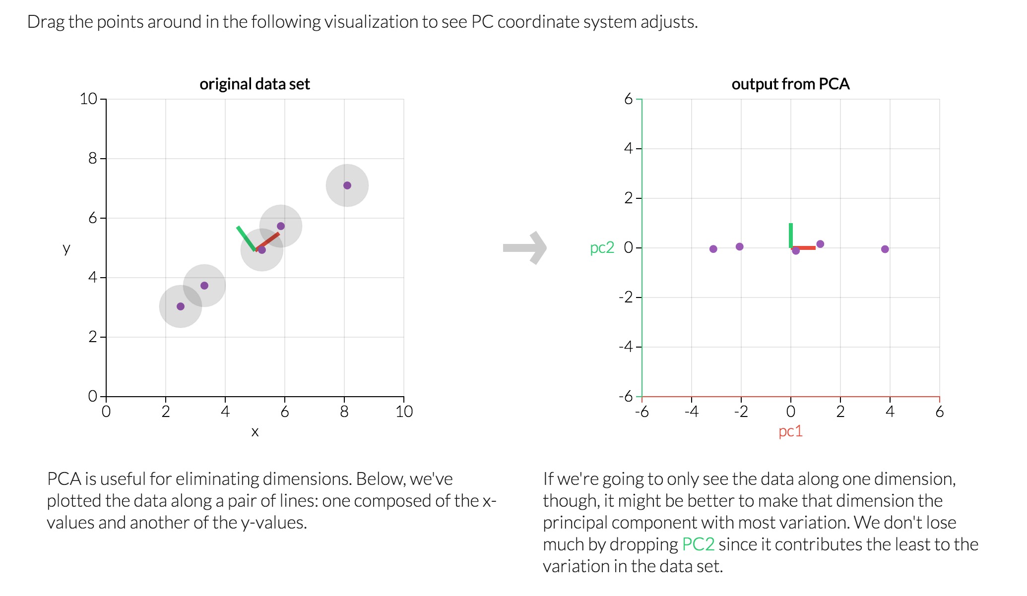
Delicatessenbut littleFresh, as well as those who buy in the opposite pattern.Principal component analysis (PCA) is a technique used to emphasize variation and bring out strong patterns in a dataset. It's often used to make data easy to explore and visualize.
Consider a dataset in only two dimensions, like (height, weight). This dataset can be plotted as points in a plane. But if we want to tease out variation, PCA finds a new coordinate system in which every point has a new (x,y) value. The axes don't actually mean anything physical; they're combinations of height and weight called "principal components" that are chosen to give one axes lots of variation.
Reference: http://setosa.io/ev/principal-component-analysis/
Observation
Run the code below to see how the log-transformed sample data has changed after having a PCA transformation applied to it in six dimensions. Observe the numerical value for the first four dimensions of the sample points. Consider if this is consistent with your initial interpretation of the sample points.
# Display sample log-data after having a PCA transformation applied
display(pd.DataFrame(np.round(pca_samples, 4), columns = pca_results.index.values))
Implementation: Dimensionality Reduction
When using principal component analysis, one of the main goals is to reduce the dimensionality of the data — in effect, reducing the complexity of the problem. Dimensionality reduction comes at a cost: Fewer dimensions used implies less of the total variance in the data is being explained. Because of this, the cumulative explained variance ratio is extremely important for knowing how many dimensions are necessary for the problem. Additionally, if a signifiant amount of variance is explained by only two or three dimensions, the reduced data can be visualized afterwards.
In the code block below, you will need to implement the following:
- Assign the results of fitting PCA in two dimensions with
good_datatopca. - Apply a PCA transformation of
good_datausingpca.transform, and assign the reuslts toreduced_data. - Apply a PCA transformation of the sample log-data
log_samplesusingpca.transform, and assign the results topca_samples.
# Fit PCA to the good data using only two dimensions
pca = PCA(n_components = 2).fit(good_data)

# Apply a PCA transformation the good data
reduced_data = pca.transform(good_data)

# Apply a PCA transformation to the sample log-data
pca_samples = pca.transform(log_samples)

# Create a DataFrame for the reduced data
reduced_data = pd.DataFrame(reduced_data, columns = ['Dimension 1', 'Dimension 2'])
# Produce a scatter matrix for pca reduced data
pd.scatter_matrix(reduced_data, alpha = 0.8, figsize = (10, 5), diagonal = 'kde');

Observation
Run the code below to see how the log-transformed sample data has changed after having a PCA transformation applied to it using only two dimensions. Observe how the values for the first two dimensions remains unchanged when compared to a PCA transformation in six dimensions.
# Display sample log-data after applying PCA transformation in two dimensions
display(pd.DataFrame(np.round(pca_samples, 4), columns = ['Dimension 1', 'Dimension 2']))
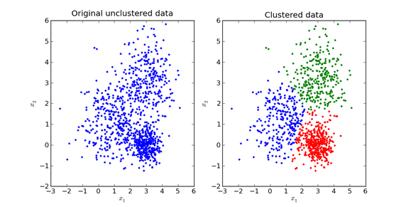
Clustering
In this section, you will choose to use either a K-Means clustering algorithm or a Gaussian Mixture Model clustering algorithm to identify the various customer segments hidden in the data. You will then recover specific data points from the clusters to understand their significance by transforming them back into their original dimension and scale.
Question 6
What are the advantages to using a K-Means clustering algorithm? What are the advantages to using a Gaussian Mixture Model clustering algorithm? Given your observations about the wholesale customer data so far, which of the two algorithms will you use and why?
Answer:
What are the advantages to using a K-Means clustering algorithm?
- K-means is simple and fast, effective for massive datasets.
- The omplexity is $O(n K_t)$ which is close to linear.
- Disadvantage: hard to confirm the $k$ and the center.
What are the advantages to using a Gaussian Mixture Model clustering algorithm?
- GMM is a probablilistic model that consider the log-likelihood function and expectation maximization, then consider the score.
- GMM obtains and incorporates more information than K-means about the covariance structure of the data.
Compared by speed/Scalability:
- K-Means faster and more scalable
- GMM slower due to using information about the data distribution — e.g., probabilities of points belonging to clusters.
Compared by cluster assignment:
- K-Means is hard assignment (certain) of points to cluster (assumes symmetrical spherical shapes)
- GMM is soft assignment (uncertain) gives more information such as probabilities (assumes elliptical shape)
Given your observations about the wholesale customer data so far, which of the two algorithms will you use and why?
- I choose the K-means because it seems to be a good start if you don't know much about the structure of the dataset.
Reference: https://www.quora.com/What-is-the-difference-between-K-means-and-the-mixture-model-of-Gaussian
Implementation: Creating Clusters
Depending on the problem, the number of clusters that you expect to be in the data may already be known. When the number of clusters is not known a priori, there is no guarantee that a given number of clusters best segments the data, since it is unclear what structure exists in the data — if any. However, we can quantify the "goodness" of a clustering by calculating each data point's silhouette coefficient. The silhouette coefficient for a data point measures how similar it is to its assigned cluster from -1 (dissimilar) to 1 (similar). Calculating the mean silhouette coefficient provides for a simple scoring method of a given clustering.
In the code block below, you will need to implement the following:
- Fit a clustering algorithm to the
reduced_dataand assign it toclusterer. - Predict the cluster for each data point in
reduced_datausingclusterer.predictand assign them topreds. - Find the cluster centers using the algorithm's respective attribute and assign them to
centers. - Predict the cluster for each sample data point in
pca_samplesand assign themsample_preds. - Import sklearn.metrics.silhouette_score and calculate the silhouette score of
reduced_dataagainstpreds.- Assign the silhouette score to
scoreand print the result.
- Assign the silhouette score to
from sklearn.cluster import KMeans
## from sklearn.mixture import GMM
from sklearn.metrics import silhouette_score

scores = dict()
for i in range(2,10): # (2,6)
    clusterer = KMeans(n_clusters = i, random_state = 42).fit(reduced_data)  ## GMM(n_components = i, ...)
    # TODO: Predict the cluster for each data point
    preds = clusterer.predict(reduced_data)
    # TODO: Find the cluster centers
    centers = clusterer.cluster_centers_
    # TODO: Predict the cluster for each transformed sample data point
    sample_preds = clusterer.predict(pca_samples)
    # TODO: Calculate the mean silhouette coefficient for the number of clusters chosen
    score = silhouette_score(reduced_data, preds)
    scores[i] = score

print "The Silhouette Score with k:"
display(scores)
Question 7
Report the silhouette score for several cluster numbers you tried. Of these, which number of clusters has the best silhouette score?
Answer:
Report the silhouette score for several cluster numbers you tried.
- Silhouette Scoure with k = {2: 0.4471, 3: 0.3639, 4: 0.3311, 5: 0.3531, 6: 0.3637, 7: 0.3553, 8: 0.3689, 9: 0.3674}
Of these, which number of clusters has the best silhouette score?
- Chose the clusters k = 2
# Apply your clustering algorithm of choice to the reduced data
clusterer = KMeans(n_clusters = 2, random_state = 42).fit(reduced_data)
# Predict the cluster for each data point
preds = clusterer.predict(reduced_data)
# Find the cluster centers
centers = clusterer.cluster_centers_
# Predict the cluster for each transformed sample data point
sample_preds = clusterer.predict(pca_samples)
# Calculate the mean silhouette coefficient for the number of clusters chosen
score = silhouette_score(reduced_data, preds)

print score.round(4);
Cluster Visualization
Once you've chosen the optimal number of clusters for your clustering algorithm using the scoring metric above, you can now visualize the results by executing the code block below. Note that, for experimentation purposes, you are welcome to adjust the number of clusters for your clustering algorithm to see various visualizations. The final visualization provided should, however, correspond with the optimal number of clusters.
# Display the results of the clustering from implementation
rs.cluster_results(reduced_data, preds, centers, pca_samples)

Implementation: Data Recovery
Each cluster present in the visualization above has a central point. These centers (or means) are not specifically data points from the data, but rather the averages of all the data points predicted in the respective clusters. For the problem of creating customer segments, a cluster's center point corresponds to the average customer of that segment. Since the data is currently reduced in dimension and scaled by a logarithm, we can recover the representative customer spending from these data points by applying the inverse transformations.
In the code block below, you will need to implement the following:
- Apply the inverse transform to
centersusingpca.inverse_transformand assign the new centers tolog_centers. - Apply the inverse function of
np.logtolog_centersusingnp.expand assign the true centers totrue_centers.
# Inverse transform the centers
log_centers = pca.inverse_transform(centers)

# Exponentiate the centers
true_centers = np.exp(log_centers)

# Display the true centers
segments = ['Segment {}'.format(i) for i in range(0,len(centers))]
true_centers = pd.DataFrame(np.round(true_centers), columns = data.keys())
true_centers.index = segments
display(true_centers);
Question 8
Consider the total purchase cost of each product category for the representative data points above, and reference the statistical description of the dataset at the beginning of this project. What set of establishments could each of the customer segments represent?
Hint: A customer who is assigned to 'Cluster X' should best identify with the establishments represented by the feature set of 'Segment X'.
Answer:
What set of establishments could each of the customer segments represent?
Segment 0: represents on the fresh is over 50% and the frozen, grocery and milk are around 25%, which would be sold in a market or some places that use fresh produce to prepare meals.
Segment 1: represents on the milk, grocery, fresh and detergents_paper are over 50%, which would be sold in a public school, university, supermarket or retailer.
# centers of K-means
true_centers = true_centers.append(data.describe().ix['25%'])
true_centers = true_centers.append(data.describe().ix['50%'])
true_centers = true_centers.append(data.describe().ix['75%'])
true_centers.plot(kind = 'bar', figsize = (16, 4));

display(data.describe().ix['25%'], data.describe().ix['50%'], data.describe().ix['75%'])
Question 9
For each sample point, which customer segment from Question 8 best represents it? Are the predictions for each sample point consistent with this?
Run the code block below to find which cluster each sample point is predicted to be.
# Display the predictions
for i, pred in enumerate(sample_preds):
    print "Sample point", i, "predicted to be in Cluster", pred

sample_preds
Answer:
Are the predictions for each sample point consistent with this?
For each sample point, which customer segment from Question 8 best represents it?
- Sample point 0 predicted to be in Cluster 1 is consistent with the prediction.
- represents customer segments who purchase
MilkandGrocery.- Sample point 1 and 2 predicted to be in Cluster 0 is consistent with the prediction.
- represents customer segments who purchase
Frozenitems.
# check if samples' spending closer to segment 0 or 1
df_diffs = (np.abs(samples-true_centers.iloc[0]) < np.abs(samples-true_centers.iloc[1])).\
applymap(lambda x: 0 if x else 1)

# see how cluster predictions align with similariy of spending in each category
df_preds = pd.concat([df_diffs, pd.Series(sample_preds, name = 'PREDICTION')], axis = 1)
sns.heatmap(df_preds, annot = True, cbar = False, yticklabels = ['sample 0', 'sample 1', 'sample 2'], \
            linewidth = .1, square = True)
plt.title('Samples closer to\ncluster 0 or 1?')
plt.xticks(rotation = 45, ha = 'center')
plt.yticks(rotation = 0);

Conclusion
In this final section, you will investigate ways that you can make use of the clustered data. First, you will consider how the different groups of customers, the customer segments, may be affected differently by a specific delivery scheme. Next, you will consider how giving a label to each customer (which segment that customer belongs to) can provide for additional features about the customer data. Finally, you will compare the customer segments to a hidden variable present in the data, to see whether the clustering identified certain relationships.
Question 10
Companies will often run A/B tests when making small changes to their products or services to determine whether making that change will affect its customers positively or negatively. The wholesale distributor is considering changing its delivery service from currently 5 days a week to 3 days a week. However, the distributor will only make this change in delivery service for customers that react positively. How can the wholesale distributor use the customer segments to determine which customers, if any, would reach positively to the change in delivery service?
Hint: Can we assume the change affects all customers equally? How can we determine which group of customers it affects the most?
Answer:
How can the wholesale distributor use the customer segments to determine which customers, if any, would reach positively to the change in delivery service?
- If the wholesales distributor implement the proposed A/B test, they should effect with every segments information. For instance, considering the segment 0 with the changes of delivery service from currently 5 days to 3 days a week, the customers spending on
Freshcategory will be affected most. Considering the segment 1 with the changes, the customers spending onGrocery,MilkandFreshwill be affected, but the degree ofFreshis less than the segment 0.- Once we run the A/B test and the results are positive, then we can consider to scale up the customer segments, and then monitor the impacts of the change. In addition, because the effect of catergories on the specific segment is not equal. We can base on the p-value of A/B test, which mean the significant effect, to compare with the segment 0 (more on
Fresh) and with the segment 1 (more onGrocery,MiklandFresh, but less effect than segment 1 onFresh).Reference: Pitfalls of A/B testing https://www.oreilly.com/ideas/evaluating-machine-learning-models/page/6/the-pitfalls-of-a-b-testing
Question 11
Additional structure is derived from originally unlabeled data when using clustering techniques. Since each customer has a customer segment it best identifies with (depending on the clustering algorithm applied), we can consider 'customer segment' as an engineered feature for the data. Assume the wholesale distributor recently acquired ten new customers and each provided estimates for anticipated annual spending of each product category. Knowing these estimates, the wholesale distributor wants to classify each new customer to a customer segment to determine the most appropriate delivery service.
How can the wholesale distributor label the new customers using only their estimated product spending and the customer segment data?
Hint: A supervised learner could be used to train on the original customers. What would be the target variable?
Answer:
How can the wholesale distributor label the new customers using only their estimated product spending and the customer segment data?
- In the supervised learning analysis, the classifications can be use in the same structure of dataset by training model for each segments. If the a new feature is added in, the model will predict the segment category for each data point as a variable, which may refine or enhance the predictive power of the supervised learning model.
Visualizing Underlying Distributions
At the beginning of this project, it was discussed that the 'Channel' and 'Region' features would be excluded from the dataset so that the customer product categories were emphasized in the analysis. By reintroducing the 'Channel' feature to the dataset, an interesting structure emerges when considering the same PCA dimensionality reduction applied earlier to the original dataset.
Run the code block below to see how each data point is labeled either 'HoReCa' (Hotel/Restaurant/Cafe) or 'Retail' the reduced space. In addition, you will find the sample points are circled in the plot, which will identify their labeling.
# Display the clustering results based on 'Channel' data
rs.channel_results(reduced_data, multiple_feature_outliers, pca_samples)

Question 12
How well does the clustering algorithm and number of clusters you've chosen compare to this underlying distribution of Hotel/Restaurant/Cafe customers to Retailer customers? Are there customer segments that would be classified as purely 'Retailers' or 'Hotels/Restaurants/Cafes' by this distribution? Would you consider these classifications as consistent with your previous definition of the customer segments?
Answer:
How well does the clustering algorithm and number of clusters you've chosen compare to this underlying distribution of Hotel/Restaurant/Cafe customers to Retailer customers?
- The clustering algorithm does a very good job compared to the underlying distribution (the red points) of Hotel/Restaurant/Cafe customers to Retail customers. Those are kind of establishements of represented by each segment and consistent with the underlying distribution as well.
Are there customer segments that would be classified as purely 'Retailers' or 'Hotels/Restaurants/Cafes' by this distribution?
- There are some customers who are misclassified by the clustering, especially in the region between the two clusters. To choose a soft clustering would probably have done better and more effective.
Would you consider these classifications as consistent with your previous definition of the customer segments?
- Yes, the clustering algorithm and number of clusters I've chosen seem to compare well with the underlying distribution of Hotel/Restaurant/Cafe customers to Retailer customers. In addition, I also curious about what result will the GMM shows. Theoretically, the GMM may show more of an overlap between the two clusters.
Note: Once you have completed all of the code implementations and successfully answered each question above, you may finalize your work by exporting the iPython Notebook as an HTML document. You can do this by using the menu above and navigating to
File -> Download as -> HTML (.html). Include the finished document along with this notebook as your submission.